Html Tutorial: HTML Responsive web design

Responsive design is about creating a website that looks good on all device. It will automatically adjust for different screen sizes and viewpoints.
Setting the viewpoint
In order to create a responsive website, add the following code to all your web page
<meta name="viewport" content="width=device-width, initial-scale=1.0">
This will set up the viewport of your page. Which will give instructions to your browser on how to control the page’s dimensions and scaling.
Responsive images
These are images that scale nicely to fit any browser size. Using the width property If the CSS width property is scaled to 100%, the image will be responsive and scale up and down
<img src="google.jpg" style="width:100%;">

Responsive Text Size
The text size can be set with a "vw" unit, which means the viewport width". That way the text will follow the size of the browser window
<h1 style="font-size: 10vw"> Hello World</h1>
Hello World
Media Queries
In addition to resizing text and images, it is also common to use media queries in responsive web pages.
<style>
    .left, .right {
        Float:left;
        Width: 20%;
    }
    .main  {
        Float: left;
        Width:60%;
    }

    /* use a media query to add a breakpoint at 800px */
    @media screen and (max-width: 800px){
        .left,  .main,  .right {
            Width:100%; /* the width is 100%, when the viewport is 800px or smaller */
        }
    }
</style>
Create Stunning Websites and Web Apps
Building different custom components in React for your web apps or websites can get very stressful. That's why we decided to build contrast. We have put together a UI kit with over 10000+ components, 5 admin dashboards and 23 additional different pages template for building almost any type of web app or webpage into a single product called Contrast Pro. Try contrast pro!
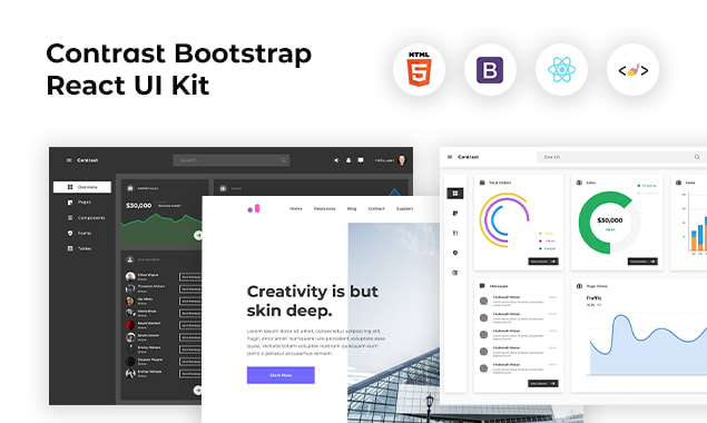
Contrast React Bootstrap PRO is a Multipurpose pro template, UI kit to build your next landing, admin, SAAS, a prelaunch, etc project with a clean, well-documented, well-crafted template and UI components. Learn more about Contrast Pro
RESOURCES
CSS Colors, Backgrounds, Borders, Margins and Padding
Differences Between Tailwind CSS and Bootstrap
Differences between Tailwind CSS and SASS
All you need to know about Html Elements
HTML File path, Charset and Meta
Including JavaScript in your HTML project.