


Tailwind Colors is one of the classes available in Tailwind CSS. Tailwind CSS boasts a lot of default color palettes to choose from for your designs and it also allows one to customize their own colors and use.
Table of Content
Introduction
Default Tailwind Color Palette
Tailwind Background Colors
Tailwind Text Color
Customizing Colors
Extending the Default Color palette
Custom Colors
Conclusion
Introduction
Tailwind colors allow web designers to create unique and visually appealing web pages. It uses an array of colors to create a consistent, harmonious look and feel across the entire website. It is a great way to create a cohesive design. Tailwind colors also provide a wide variety of colors to choose from, allowing designers to create a unique look.
In this post, you will learn how to use tailwind CSS colors, to customize the colors and even create your own color palette.
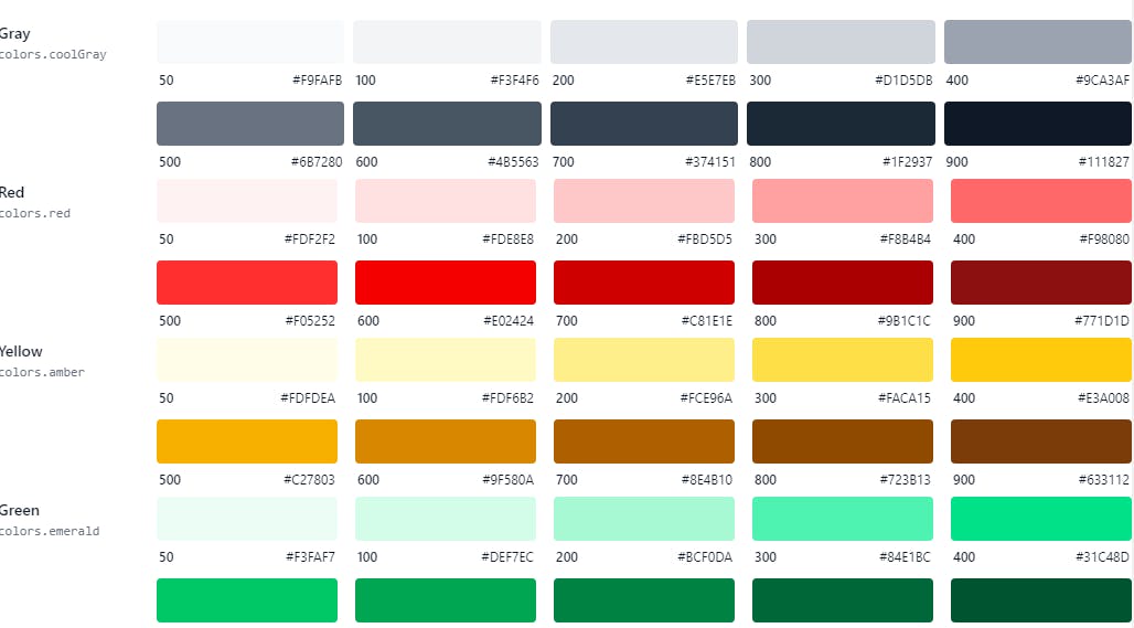
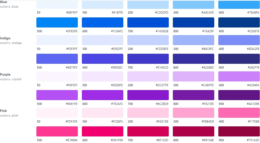
Default Tailwind Color Palette
Tailwind Colors come with a well made color palette for everyone. Even if you don't know the color to use for your project, you can easily start with the ones provided by Tailwind Color palette.
Tailwind Background Colors
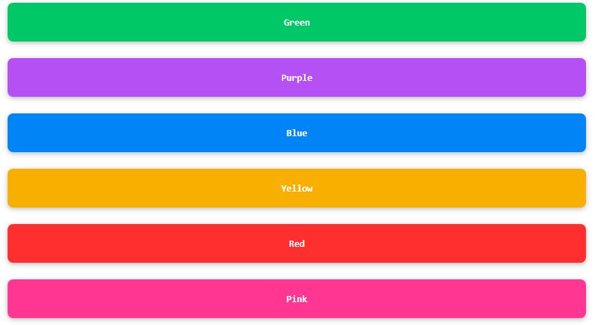
We can easily set the Tailwind Background color by using the bg-[color], where the [color] is the name of the color you want applied.
<div class="relative rounded-xl overflow-auto p-8">
<div class="flex flex-col gap-4 font-mono text-white text-sm text-center font-extrabold leading-6 bg-stripes-fuchsia rounded-lg">
<button class="bg-green-500 rounded-lg p-3">Green</button>
 <button class="bg-purple-500 rounded-lg p-3">Purple</button>
 <button class="bg-blue-500 rounded-lg p-3">Blue</button>
<button class="bg-yellow-500 rounded-lg p-3">Yellow</button>
 <button class="bg-red-500 rounded-lg p-3">Red</button>
<button class="bg-pink-500 rounded-lg p-3">Pink</button>
</div>
</div>
The Tailwind Background colors are shown below.
Tailwind Text Color
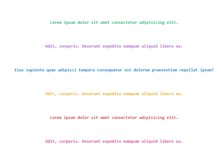
We can easily set the Tailwind colors text by using the text-[name], where the [name] represent the color name.
<div class="relative rounded-xl overflow-auto p-8">
<div class="flex flex-col gap-4 font-mono text-white text-sm text-center font-extrabold leading-6 rounded-lg">
 <p class="text-green-500 p-3">Lorem ipsum dolor sit amet consectetur adipisicing elit.</p>
<p class="text-purple-500 rounded-lg p-3"> Odit, corporis. Deserunt expedita numquam aliquid libero ea.</p>
<p class="text-blue-500 p-3"> Eius sapiente quae adipisci tempora consequatur est dolorum praesentium repellat ipsum? </p>
<p class="text-yellow-500 rounded-lg p-3">Odit, corporis. Deserunt expedita numquam aliquid libero ea.</p>
<p class="text-red-500 p-3">Lorem ipsum dolor sit amet consectetur adipisicing elit.</p>
<p class="text-pink-500 p-3">Odit, corporis. Deserunt expedita numquam aliquid libero ea.</p>
</div>
</div>
The Tailwind colors text Utilities
Customizing Colors
By default, Tailwind provides a set of basic colors, but you can add your own custom colors under the colors key in the theme section of your tailwind.config.js file.
Here’s an example of how to add a custom color:
// tailwind.config.js
module.exports = {
theme: {
colors: {
  // Configure your color palette here
  },
},
};
Extending the Default Color palette
If you don't wish to completely override the default colors provided by Tailwind CSS. You can easily extend the color palette in the tailwind.config.js file. You can do this by using the theme.extend.colors section found in the file.
// tailwind.config.js
module.exports = {
 theme: {
  extend: {
colors: {
       'elegant-green': '#51a868',
 },
 },
 },};
This generates bg-elegant-green along with the other default tailwind colors palette. As this extension is merged deeply, you can even go ahead to give it a more deeper shade of color.
// tailwind.config.js
module.exports = {
 theme: {
    extend: {
      colors: {
        green: {
                  250: '#51a868',
                },
             },
          },
       },
  };
The configuration above adds a class bg-green-250, a shade of green to the already existing ones.
Custom Colors
You can of course, change completely the Tailwind default color palette. You can replace them with your own colors.
// tailwind.config.js
module.exports = {
theme: {
   colors: {
      transparent: 'transparent',
      current: 'currentColor',
      green: {
           light: '#79d191',
           DEFAULT: '#299e49',
           dark: '#0d6926',
             },
      yellow: {
                light: '#b7c460',
                DEFAULT: '#819116',
                dark: '#768517',
                 },
       blue: {
               dark: '#009eeb',
               DEFAULT: '#1fb6ff',
               light: '#85d7ff',
                 },
             },
         },
    };
The code above is an example of replacing tailwind colors palette with your own colors.
Conclusion
Finally, Tailwind Colors empowers designers to unleash their creativity and generate aesthetically pleasing designs without sacrificing usability by enabling color customization and performance optimization.